Case study for A privately-owned finance company
Design, development & PPC in the finance sector.
Overview:
Bricks Finance is a privately-owned finance company that provides sensible financing to lenders and a better rate of return for its investors. To date, the company has completed £63,900,000 in completed loans with 0 investor losses to date. The company specialises in asset-backed businesses and bridging loans, a space once occupied by high street banks prior to regulatory reforms which stem from the 2008 financial crisis. Bricks originally approached The Yolk Media to run PPC advertising but then pivoted to brief a new website design and build. The following case study provides an overview of this process.
Sector
Finance
Bridging Loans
Expertise Delivered
Performance Marketing
Development
Visit Site
DESIGN - A full rebranding
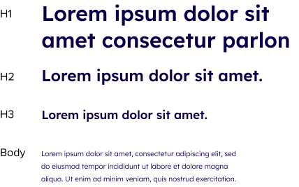
Bricks had not originally intended to rebrand their business fonts or logo. However, it quickly became apparent that the typeface and colour palette could be updated to improve UX. For example, different colours to represent different customer journeys, We also opted to use the font ‘Lexend’ in a variety of weights, as well as the enhanced colour palette below to help bring Bricks to life.

Magenta
Magenta 20%
Magenta 10%
Ink Blue
Cyan
Cyan 10%
Website Development
The previous Bricks website was built on WordPress using an off-the-shelf theme. The client was happy with the CMS but wanted a faster website and to elevate the borrow/investor experience whilst creating a structure that would allow the site to rank organically more effectively long term. The project started with keyword research to establish how customers who are looking for bridging loans or property loans might search online. This would inform the sitemap and ultimately lead to the website menu on the current site. With the sitemap established we then set about writing meta elements for the new structure and FAQs sections.
Growth - Lead acquisition in the finance sector
The previous Bricks website had a very simple structure and limited use of keyword terms which limited potential landing page visibility (aka quality score). Since launching the new website we have seen impressive improvements in like-for-like PPC metrics – we’ve used percentages to mitigate for media spend differences and compared May 2021 vs. August 2021
CPC reductions of 13.67%
Having specific landing pages improves quality scores. This is Google’s way of rewarding websites that provide content relevant to the terms they bid on. For a generic keyword-only campaign, the click-through rates (CTR) of the old site were 6.73%, on the new site this has increased to 9.74%, a +44.8% improvement.


Improving Click Share
Click share are clicks that you’ve received within search divided by the estimated maximum number of clicks that you could have received. On the old site, the total click share was 16.70% this improved to 27.93%, a +67.27% increase.
Better reporting on metrics
The website overhaul provided us with the ability to comprehensively tag and track user actions via Google Tag Manager. Users who interact with the borrow and invest calculators are counted and newsletter signups and contact form fills are tracked. All of these are useful metrics to monitor, but tracking phone calls has proven the be the most important, due to the volume received by the client. With so many variables at play, phone calls are often the best way for Bricks to deliver a highly personalised service to their customers. Each conversion point has allowed us to report more comprehensively on PPC and other channels such as organic and Linkedin.

To conclude
From an initial enquire centred around PPC, this project grew to encompass design, development, SEO and performance media. This holistic approach has allowed Bricks to smooth their customer journey, from the first impression through to website conversion.
